Tripgenie 
#Logo #App identity 
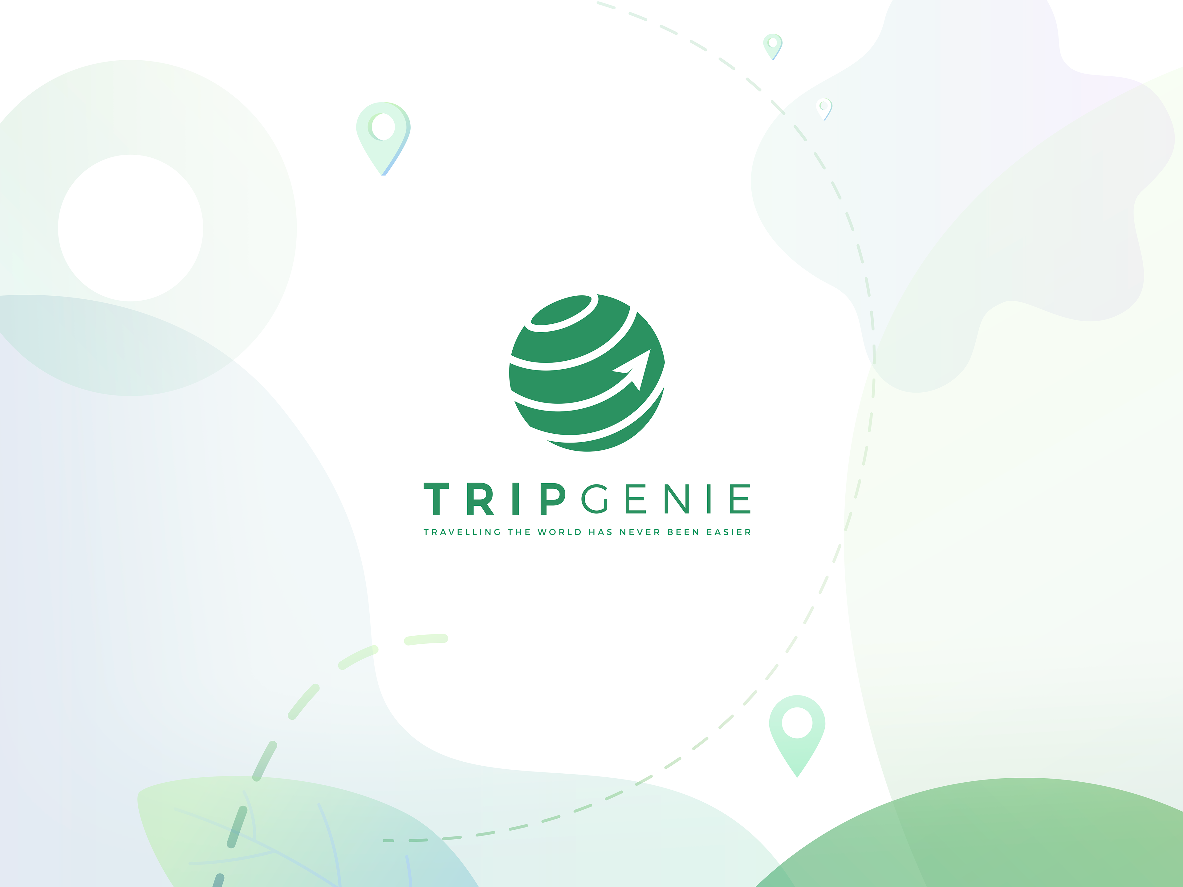
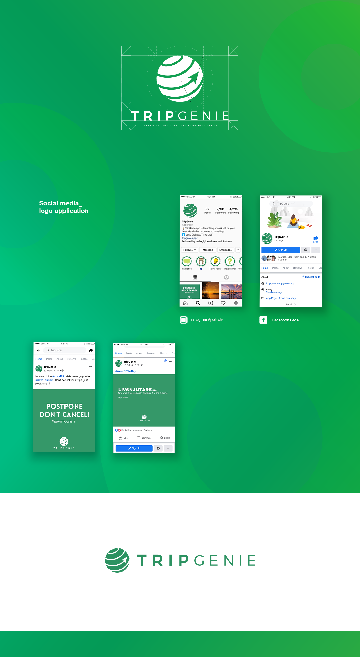
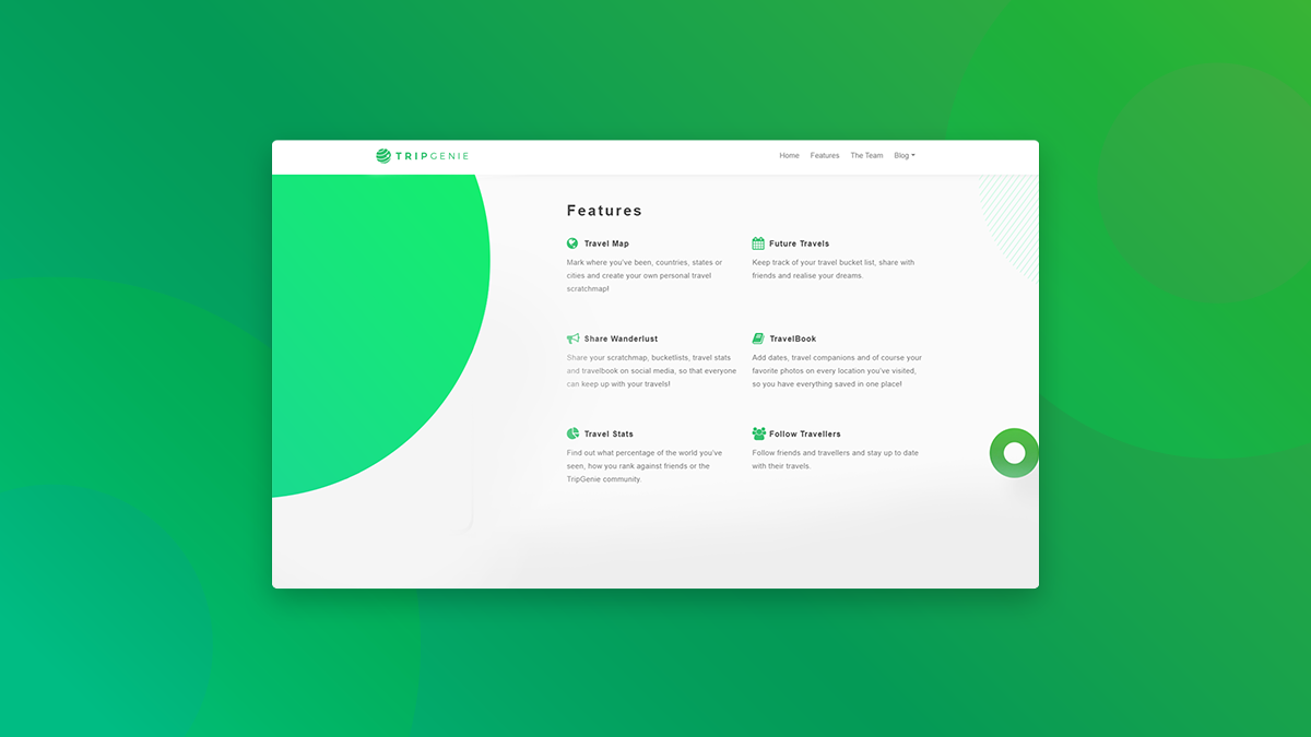
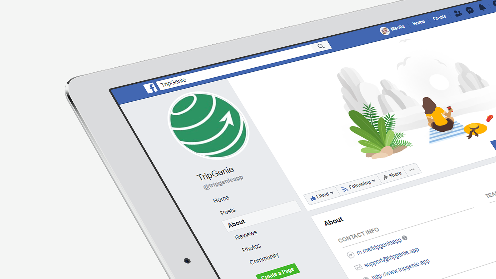
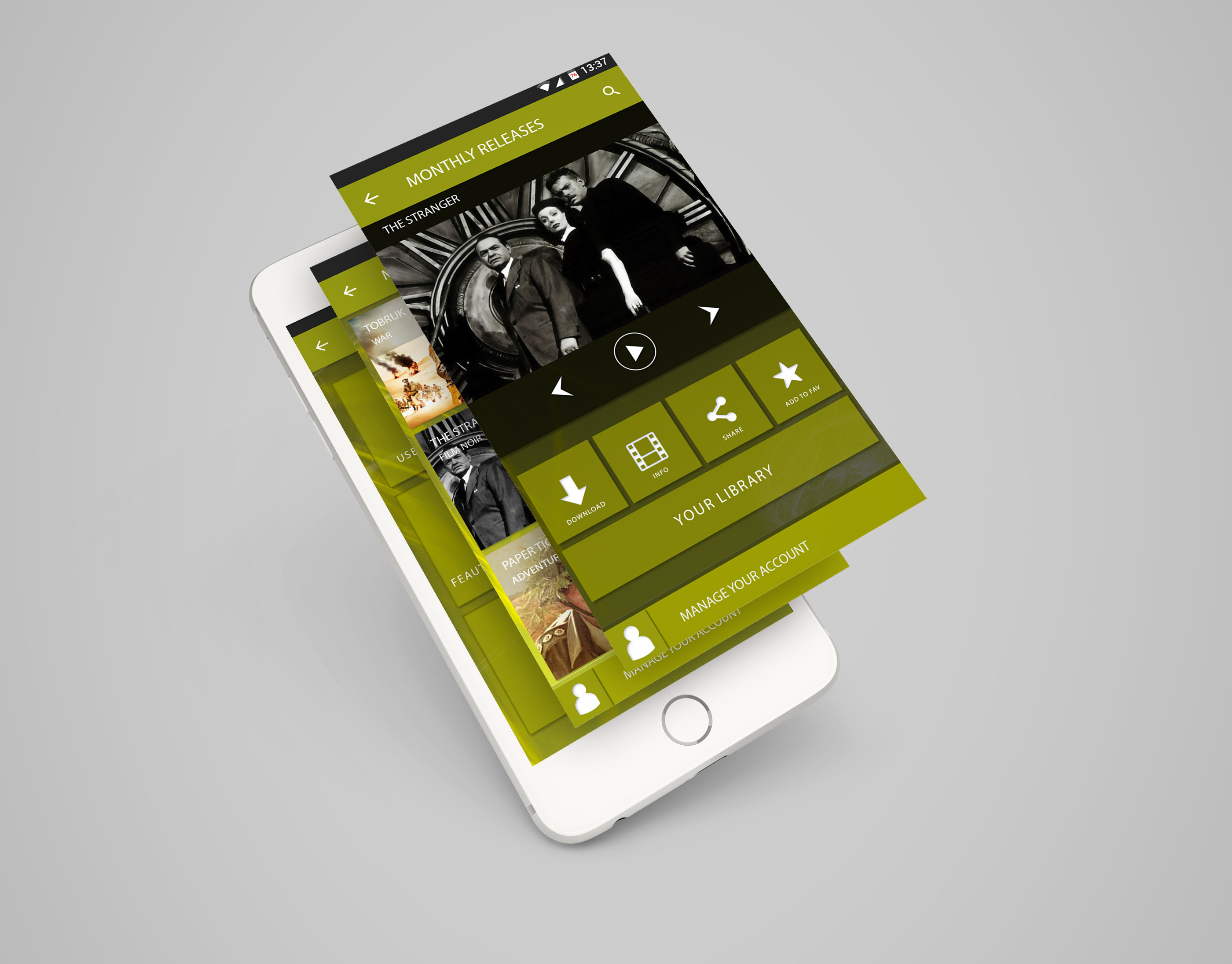
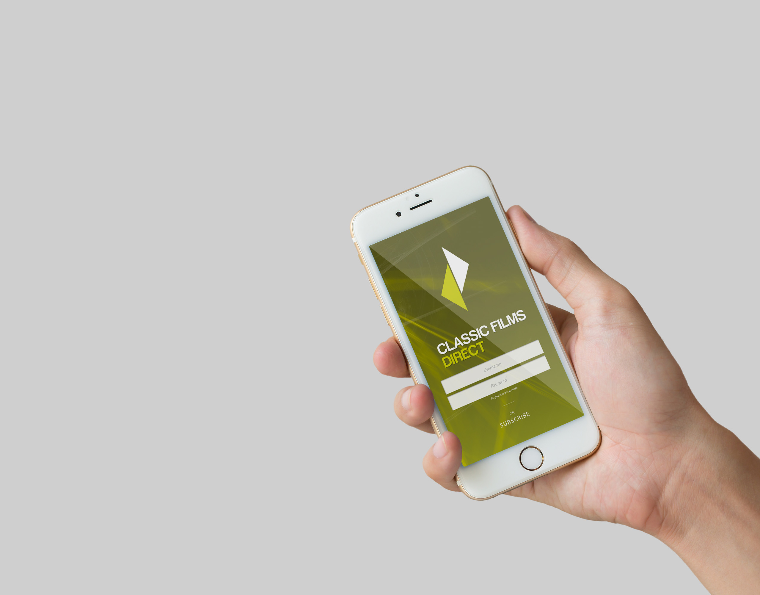
Tripgenie is an innovative travel app launching in 2020, aiming to be the number one solution tool when it comes to travel scheduling, planning and experience sharing. We have been asked to re-design the product's visual identity and develop a more digitalised and contemporary brand look and feel which we will work well on the applied platforms.

Old logo Prons and cons_

- Complex design, not readable on small scales
- Unbalanced icon, not easily applied on social media 
- Edgy points and no landscape version + Proper font choice and nice  typography 
Solution_

+ Solid clean design, the shuttle is part of the sympol form 
+ Balanced circular icon, which works great on social accounts and templates 
+ Works well on landscape and portrait versions
 + Working with the same typeface we reduced the letters’ spacing to be read easy on all platforms

You may also like

Back to Top